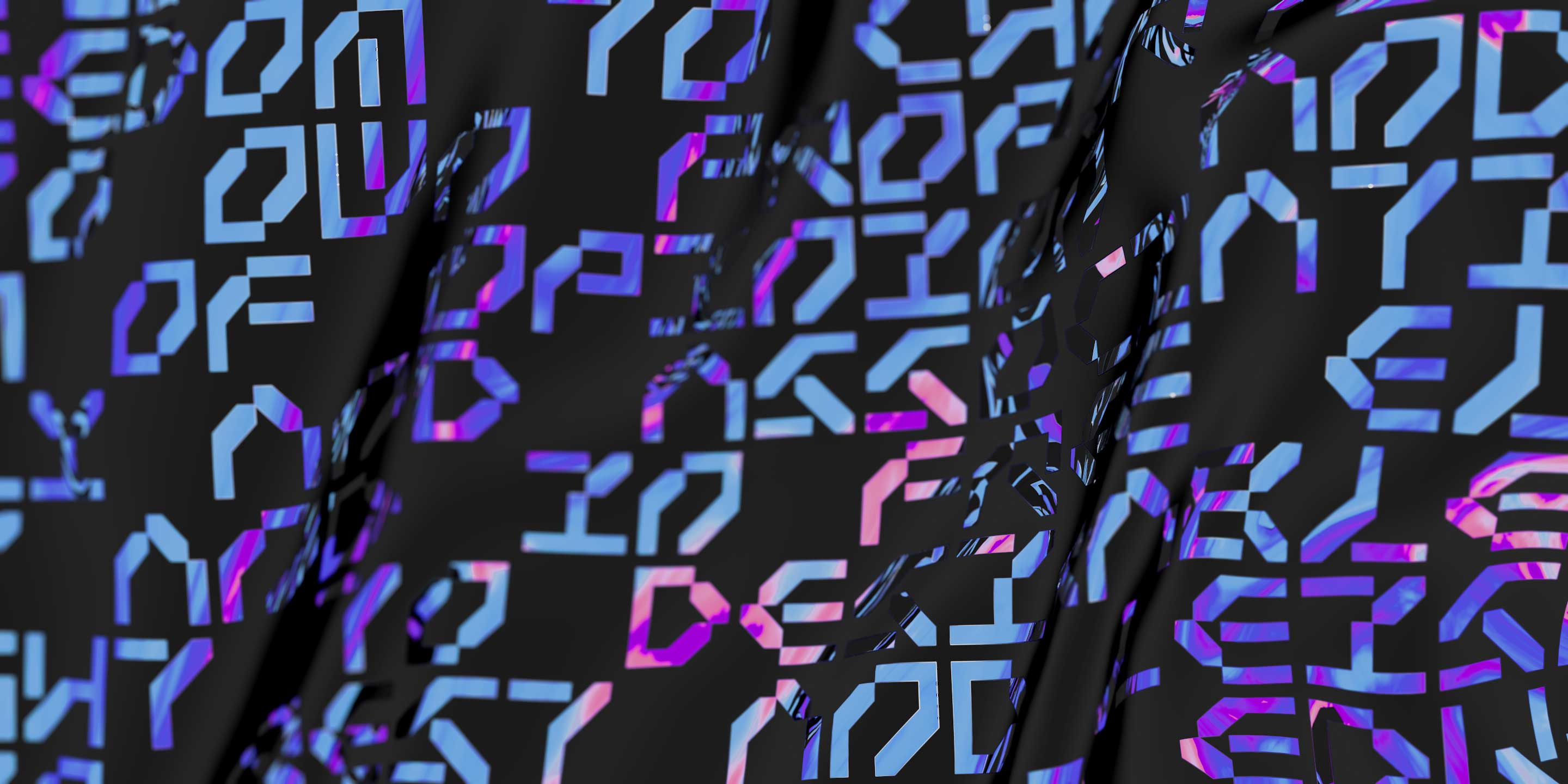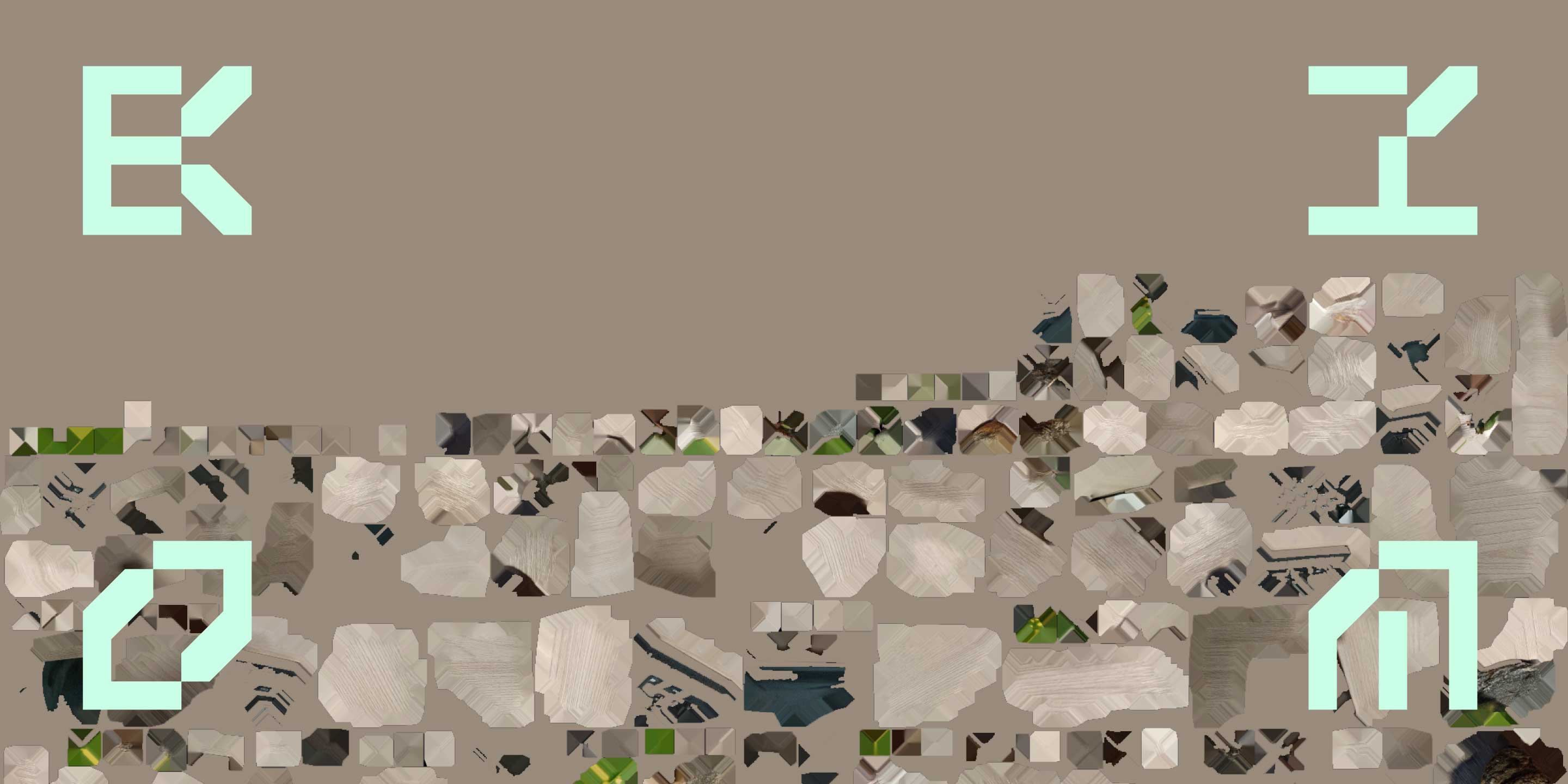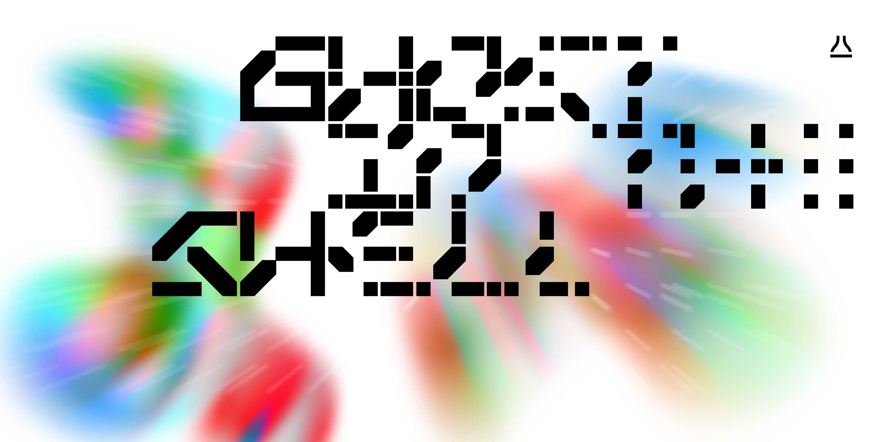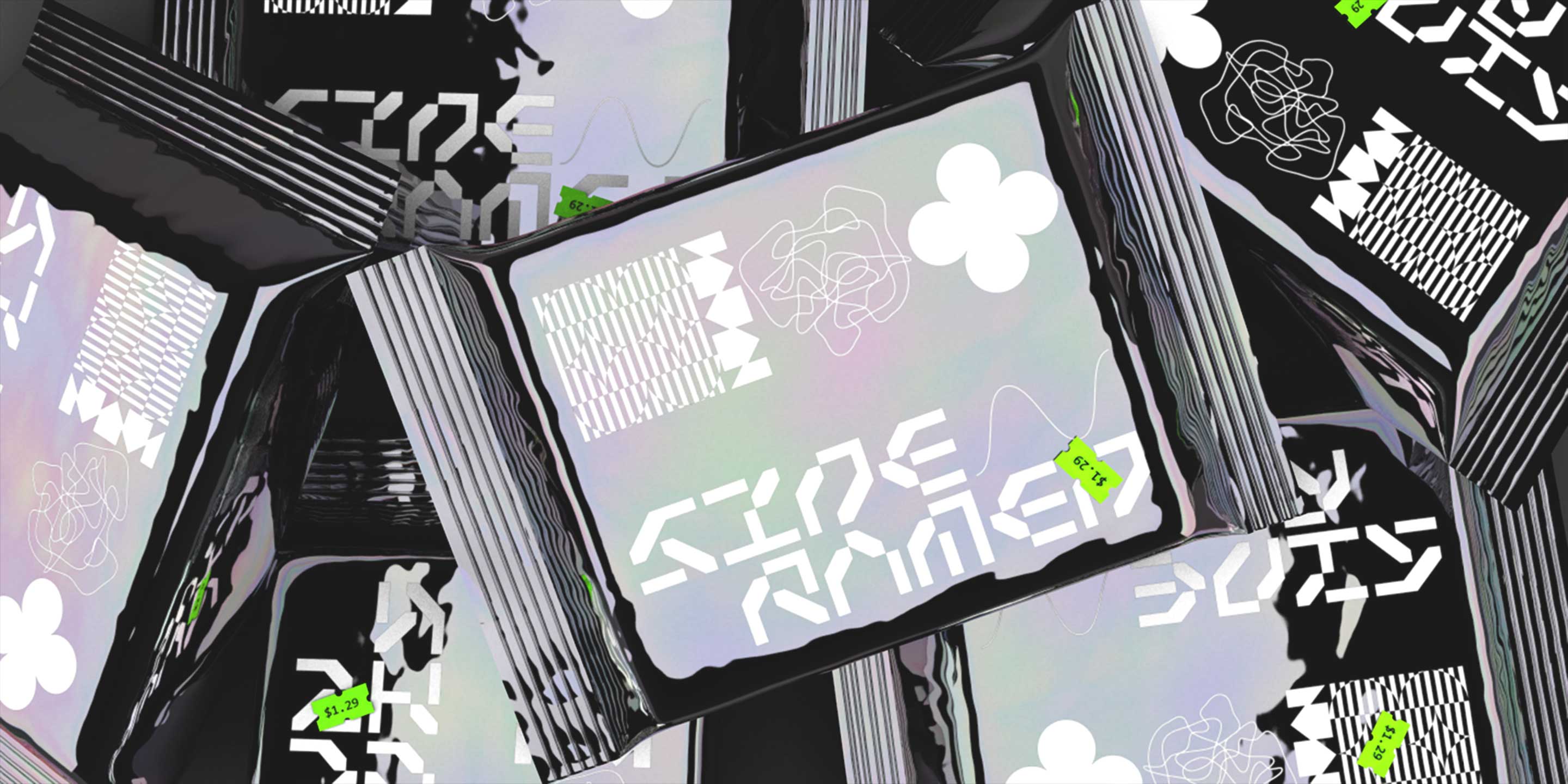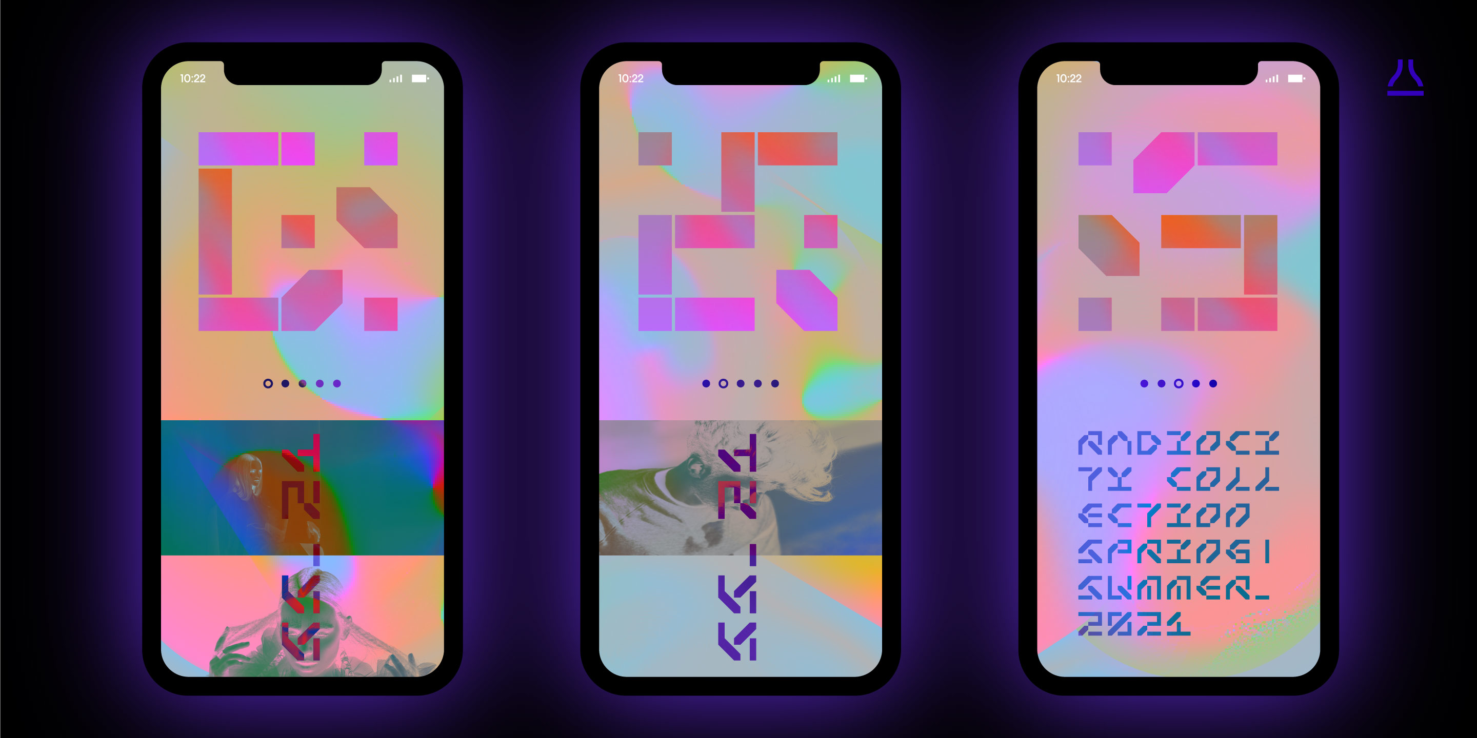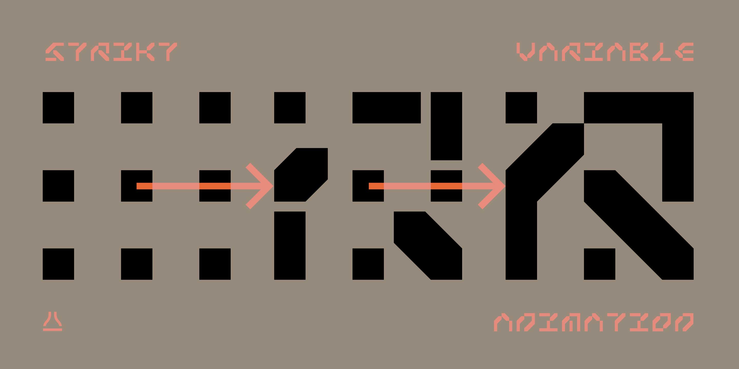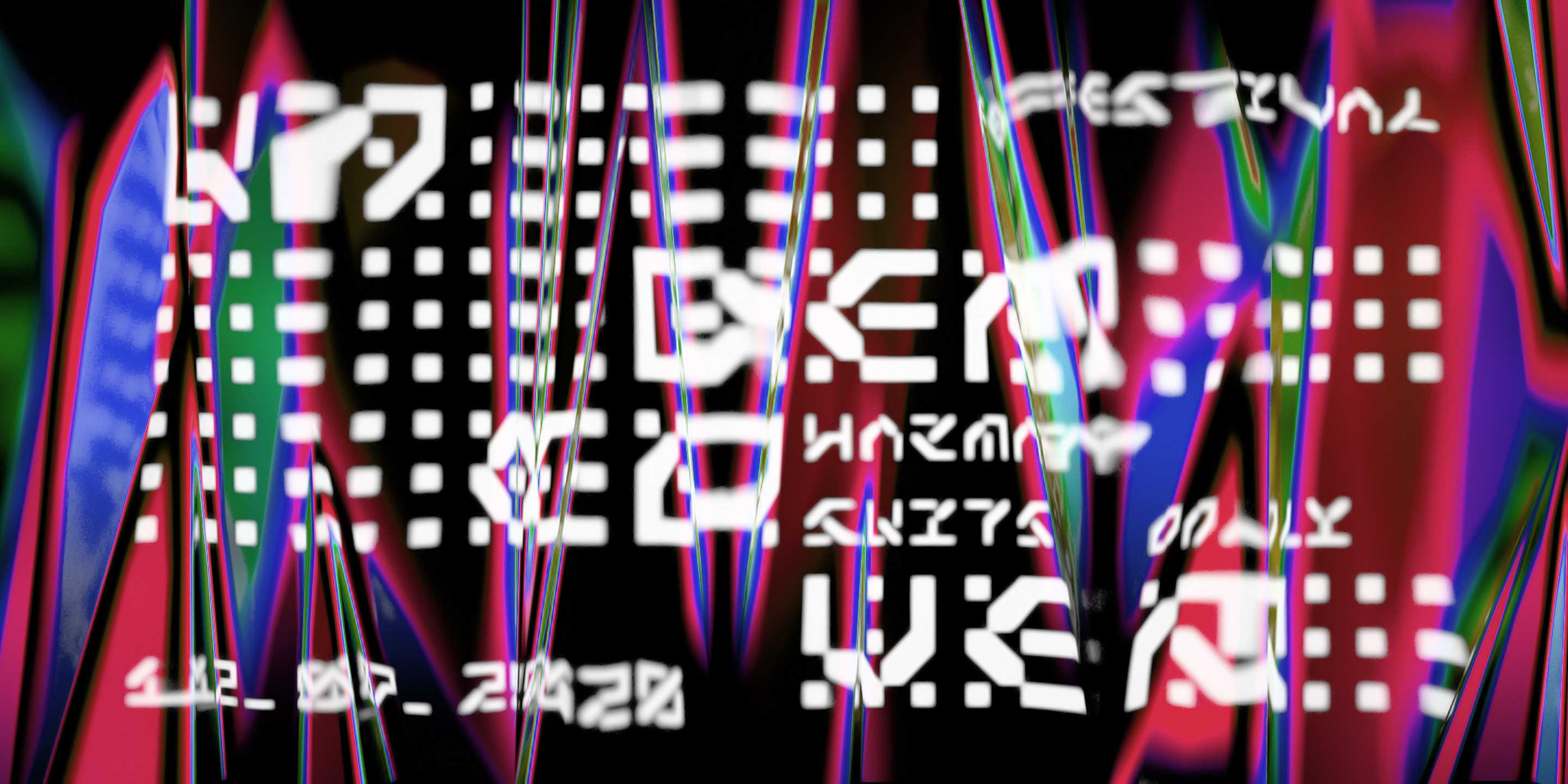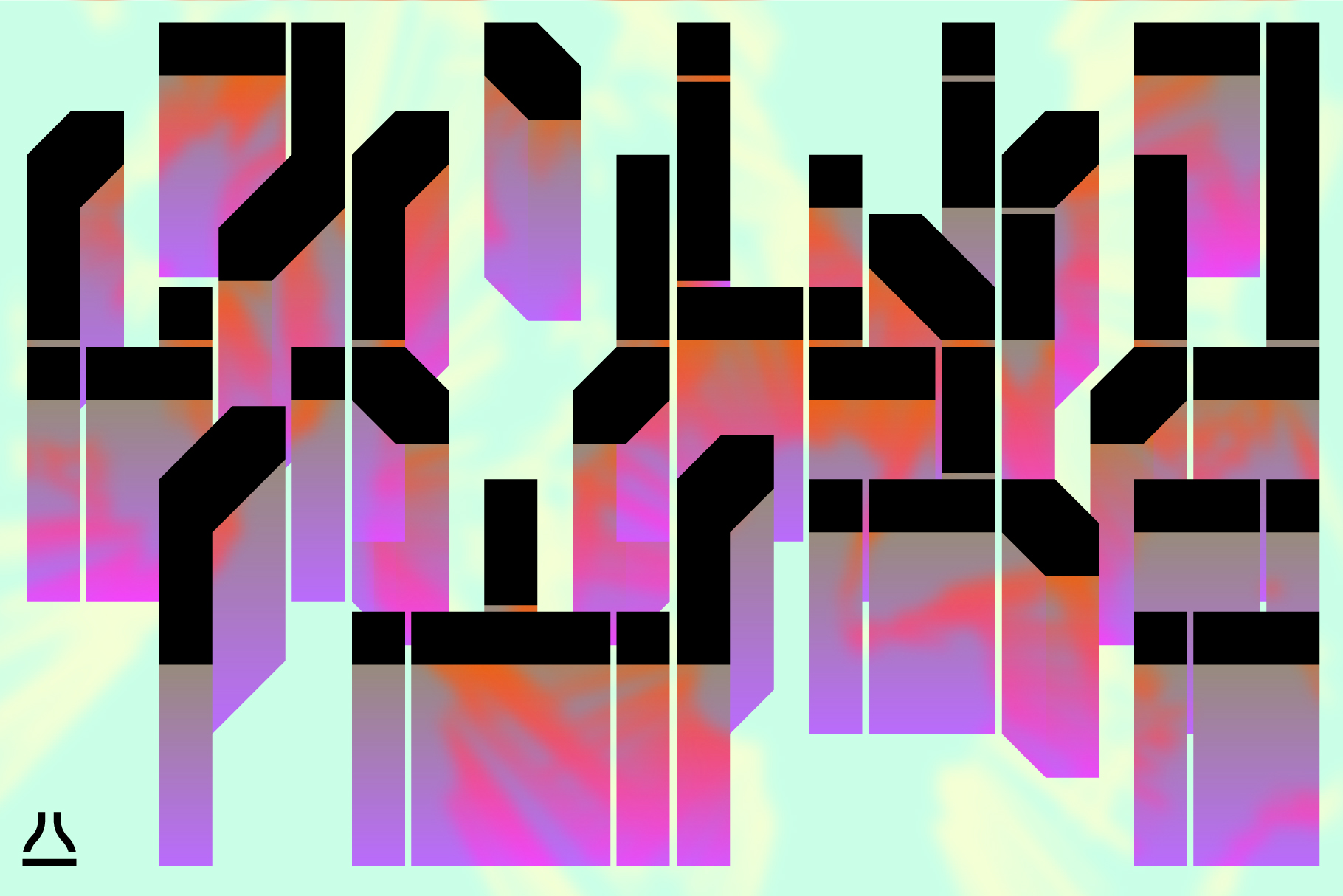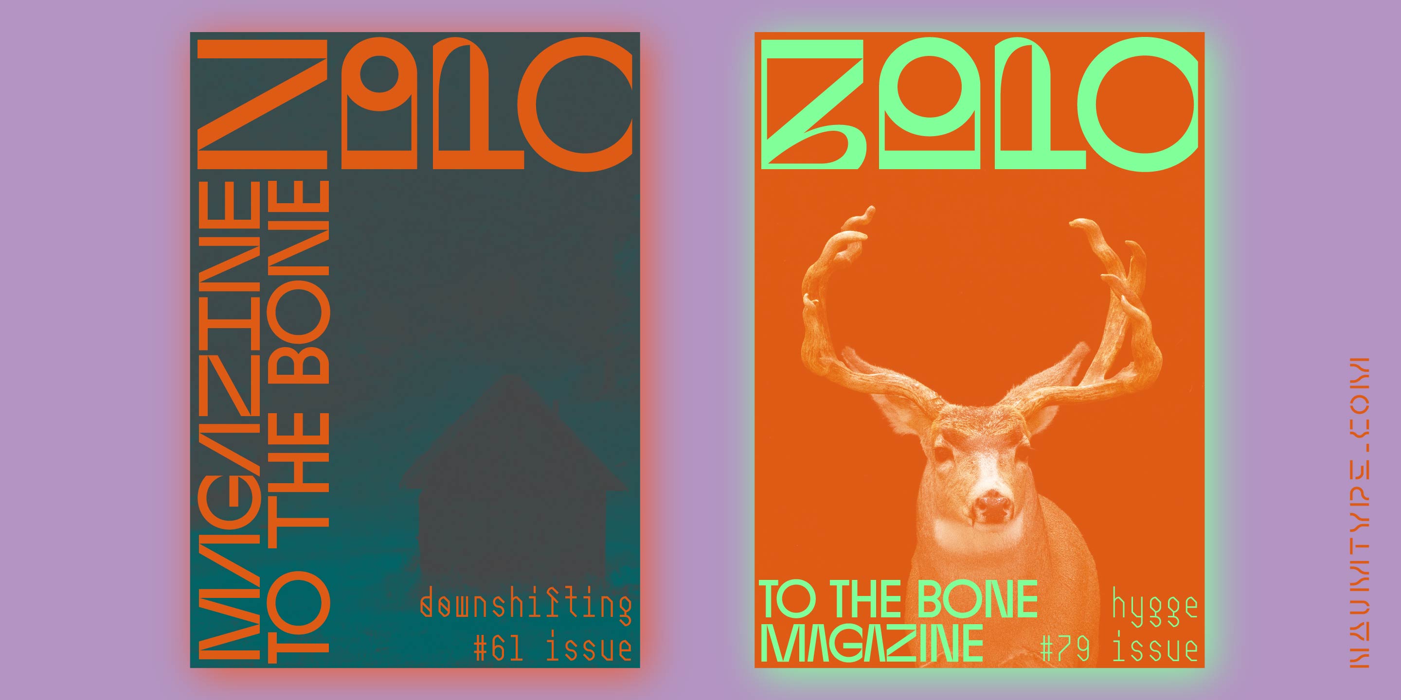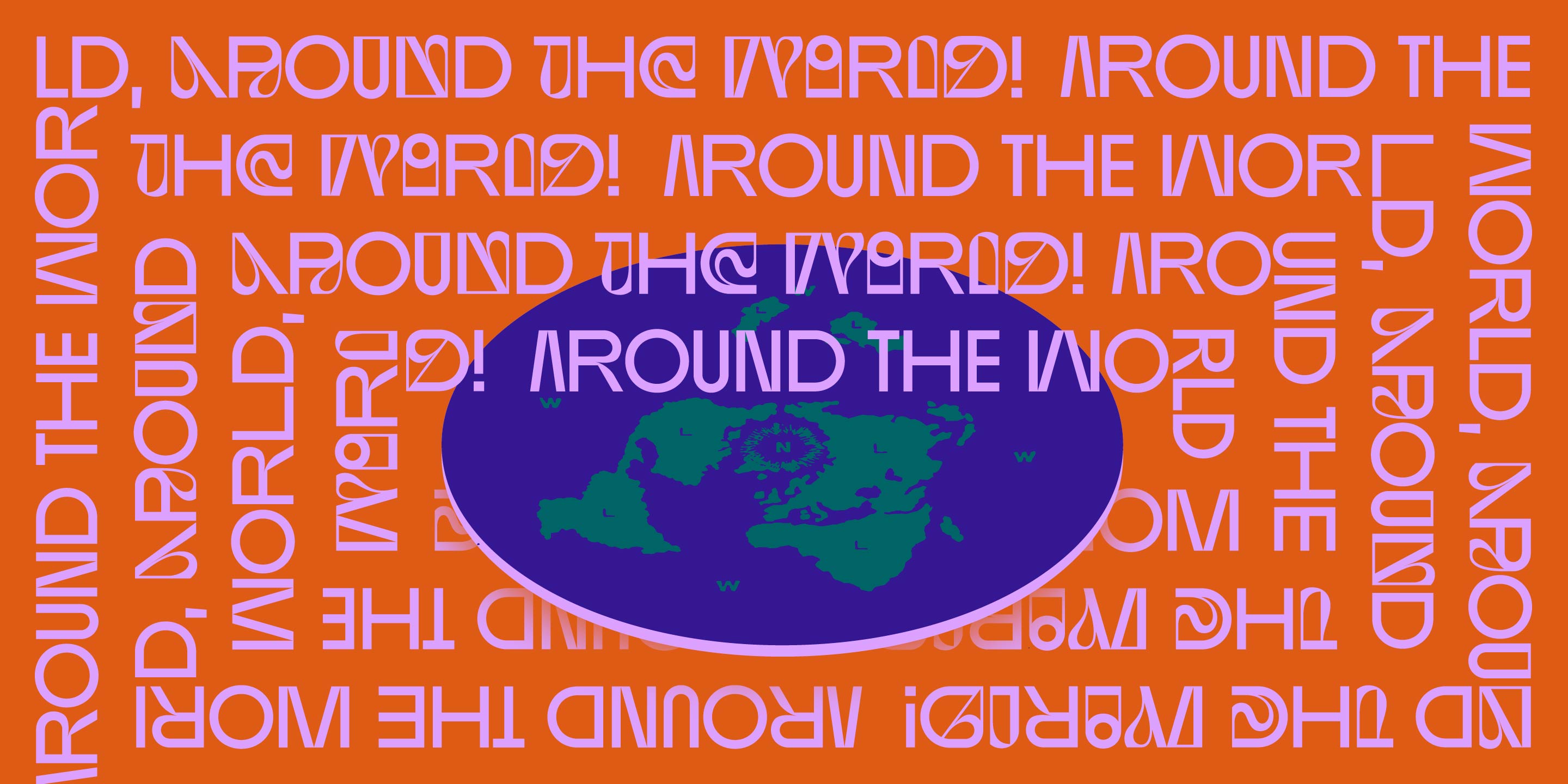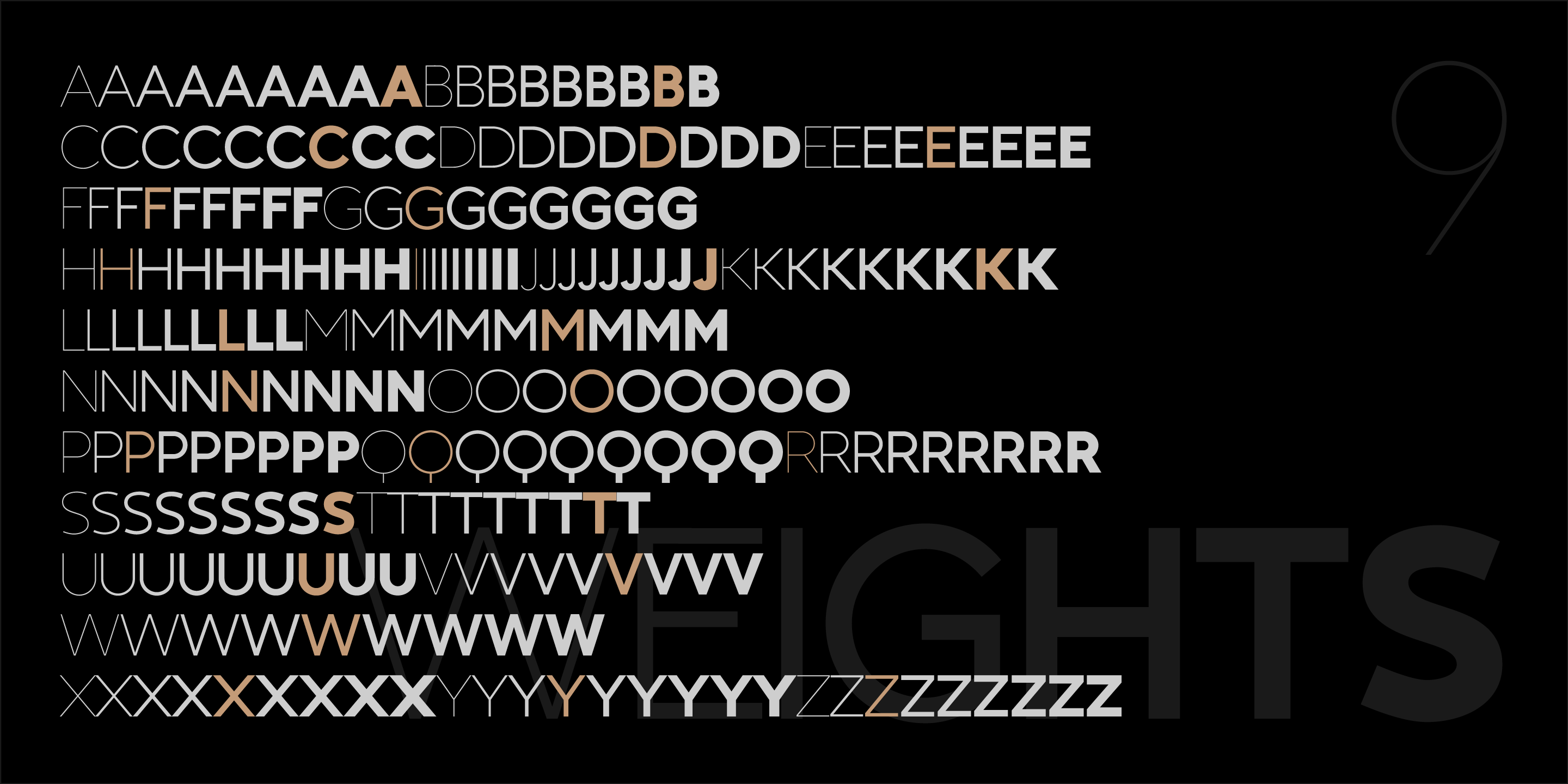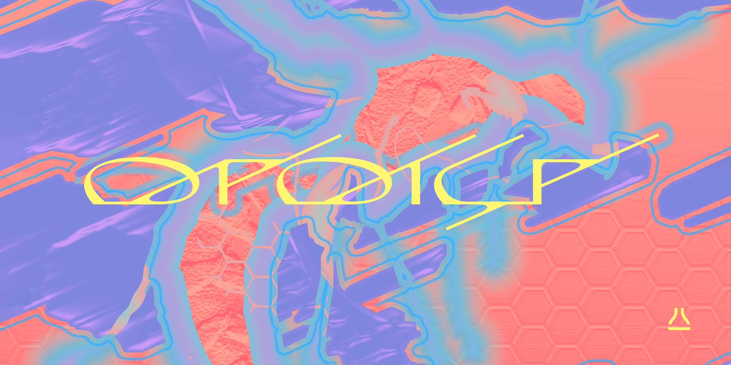
WaSP - unusual wide didone
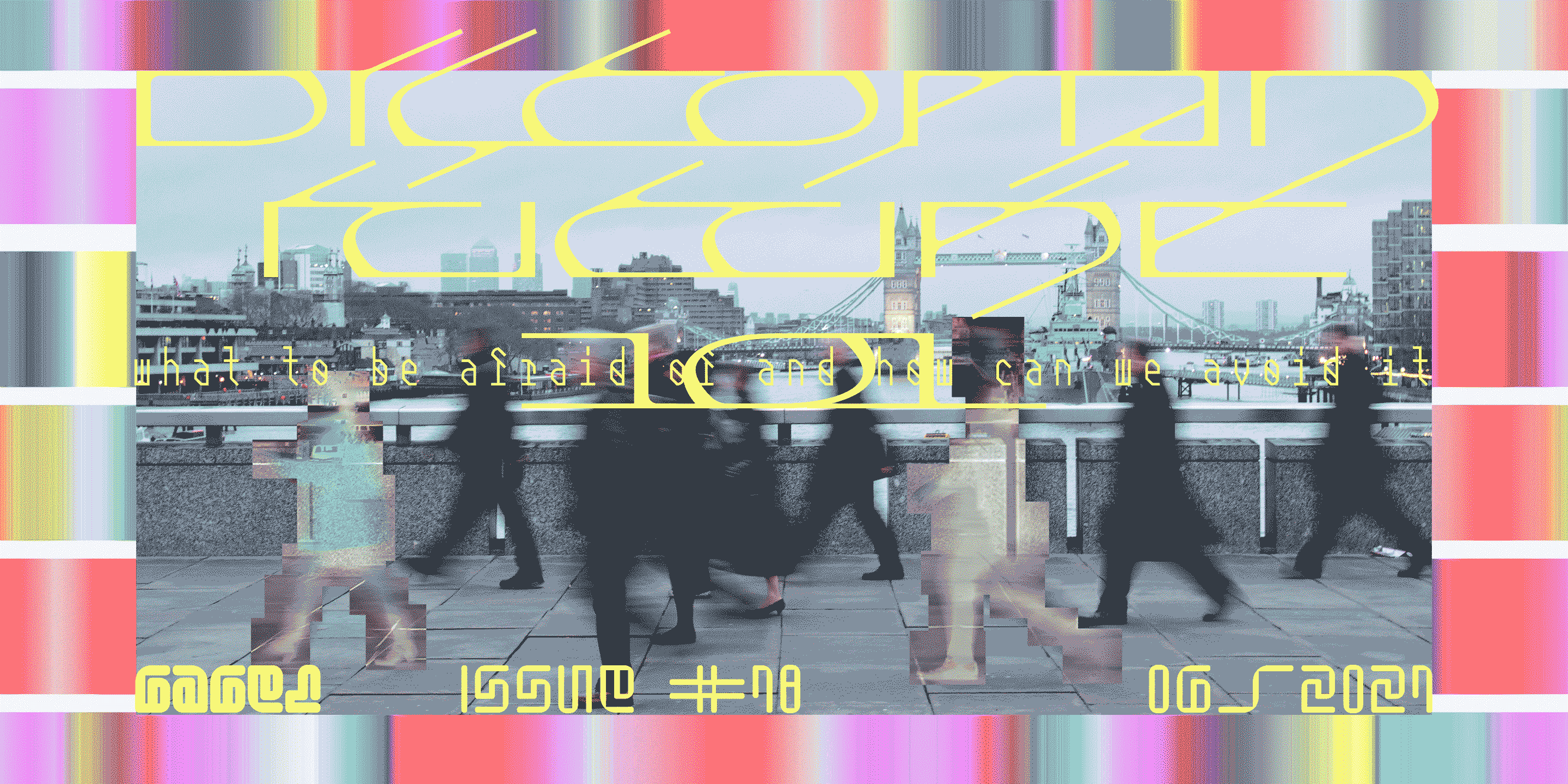
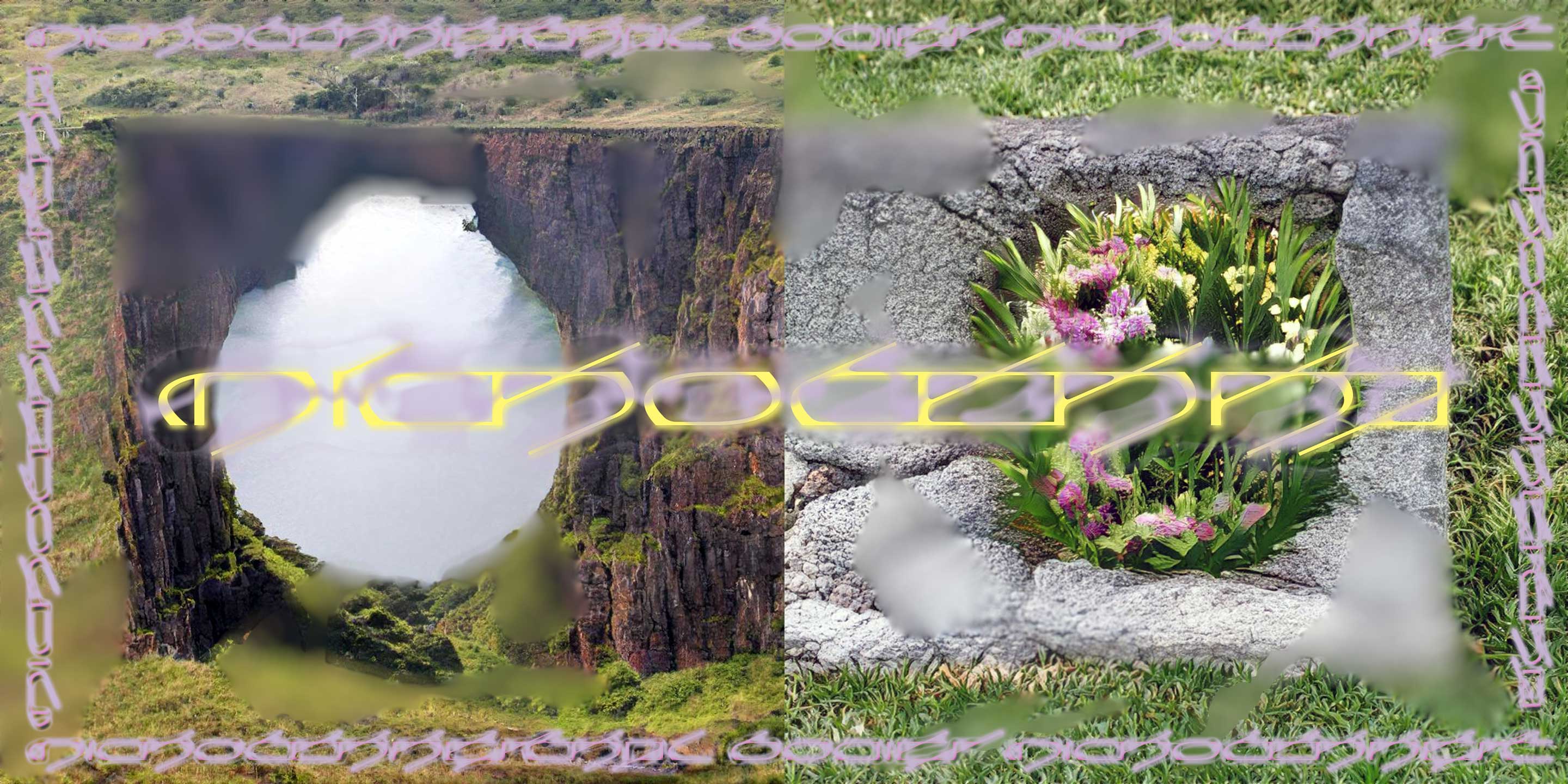
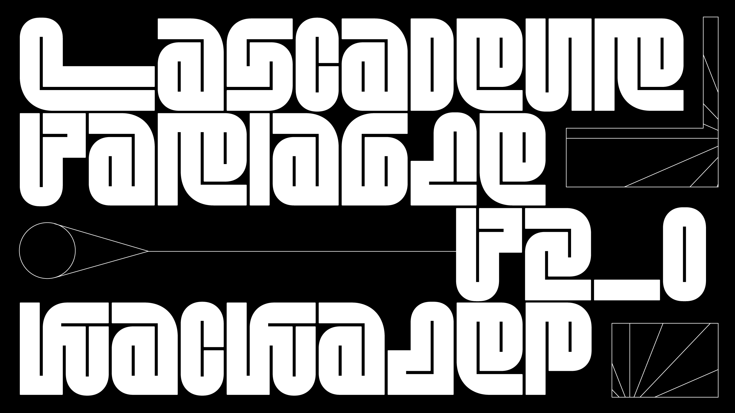
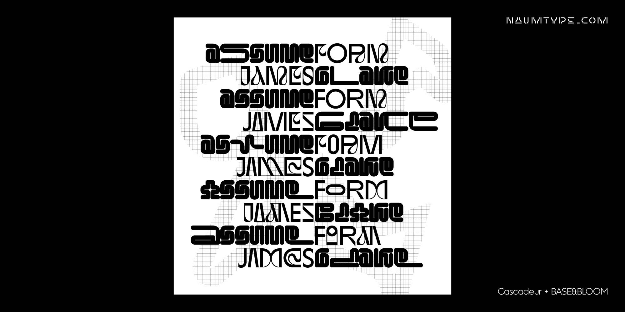
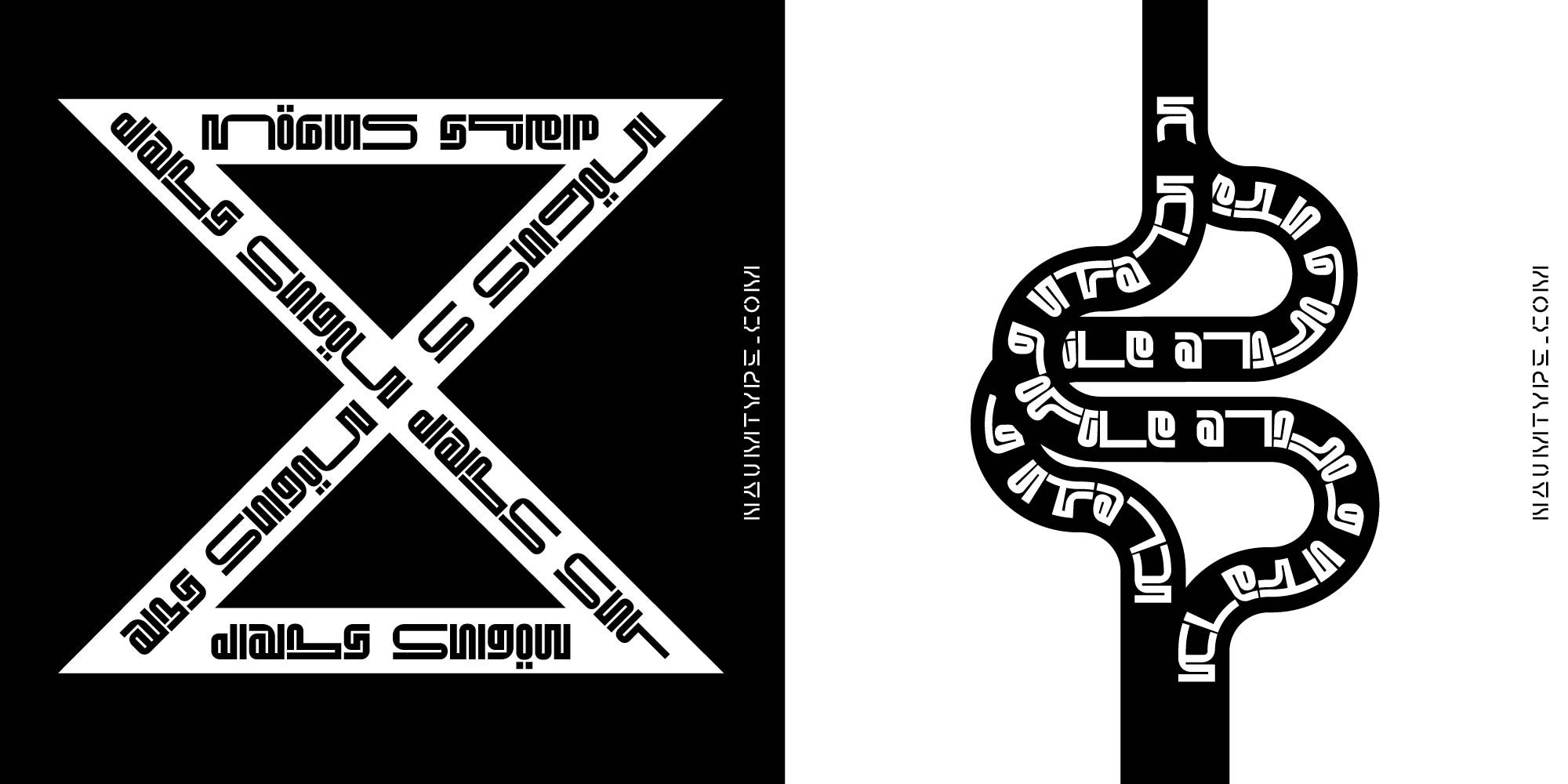
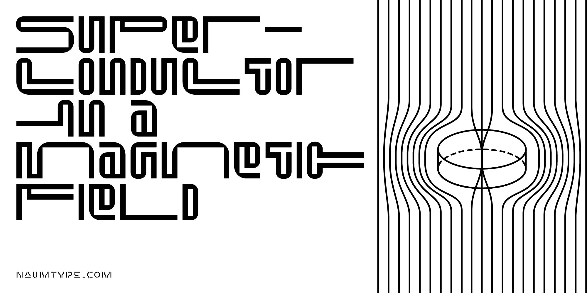
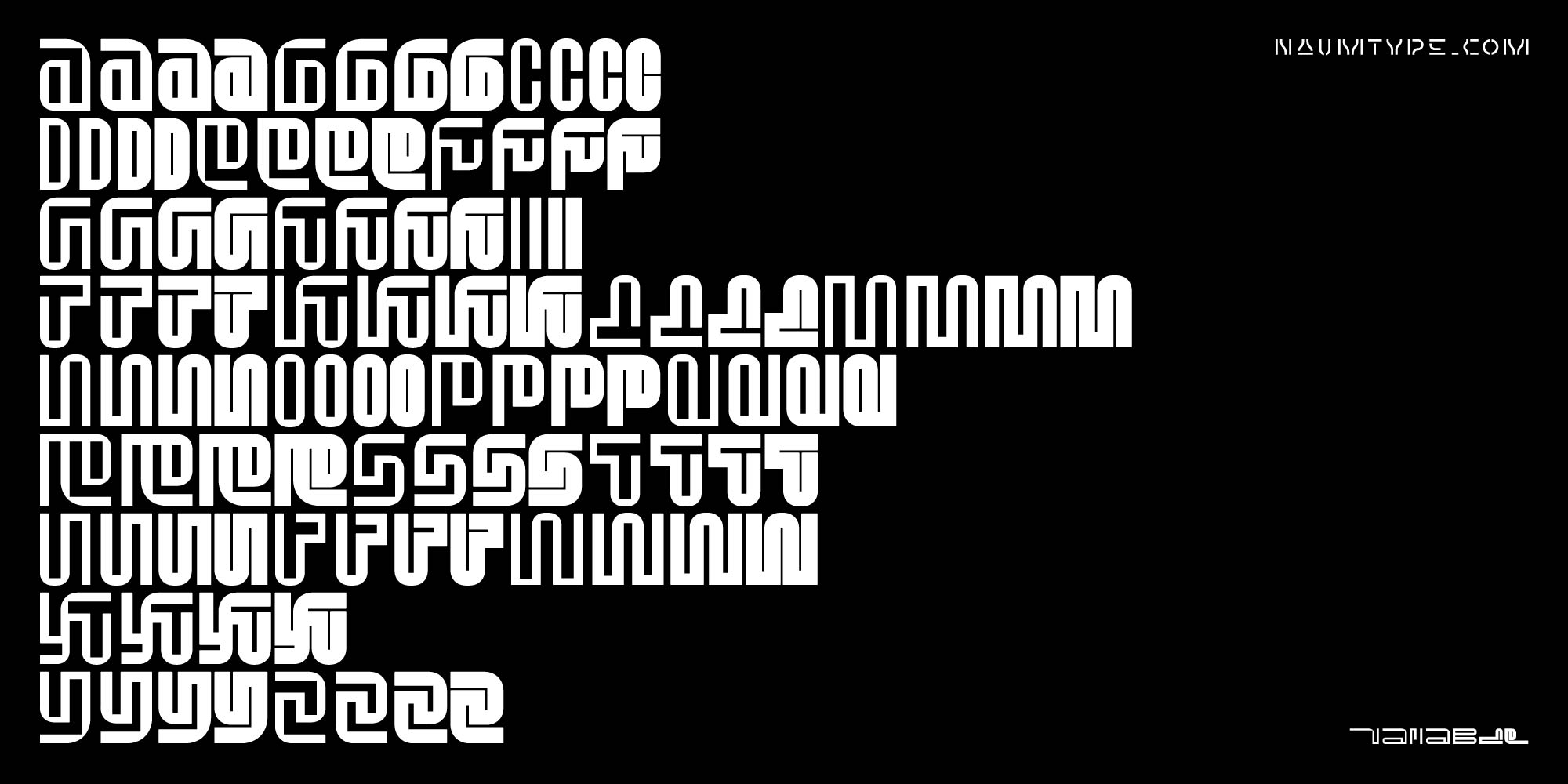
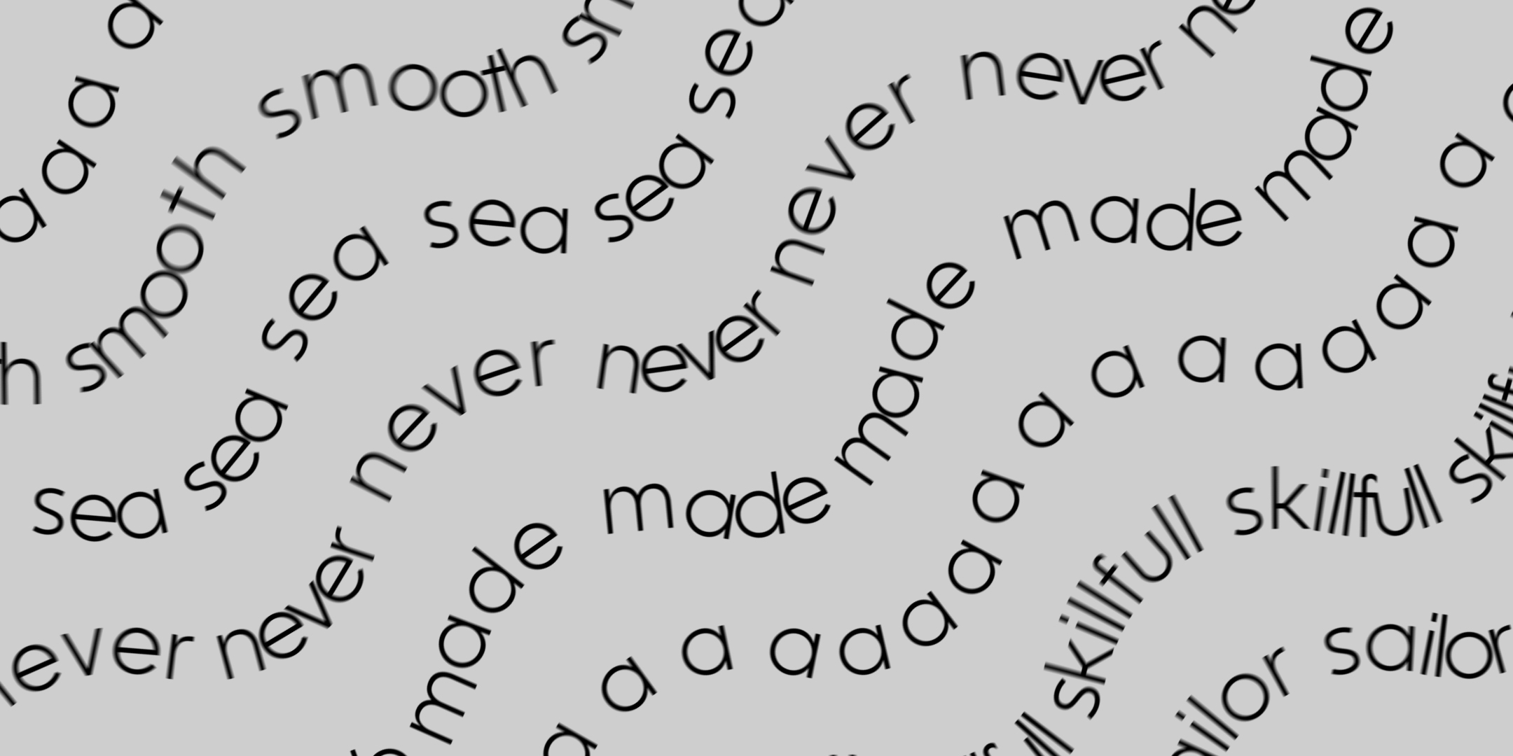
The central concept for this project is an attempt to make a letter flow that can, depending on the angle, be perceived as an ornament as well as written words.
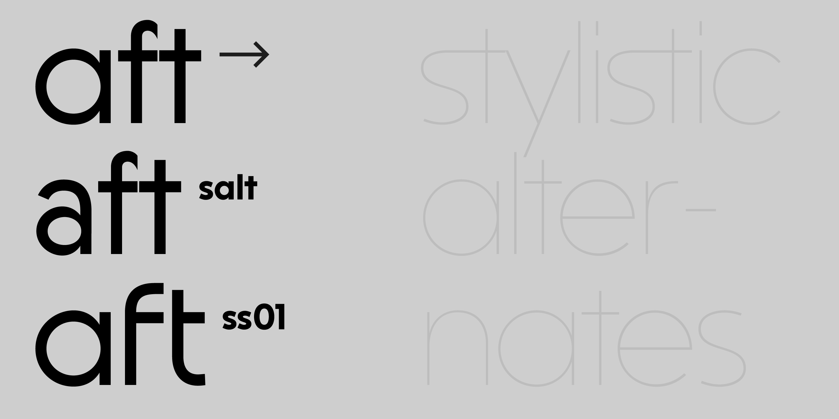
type here
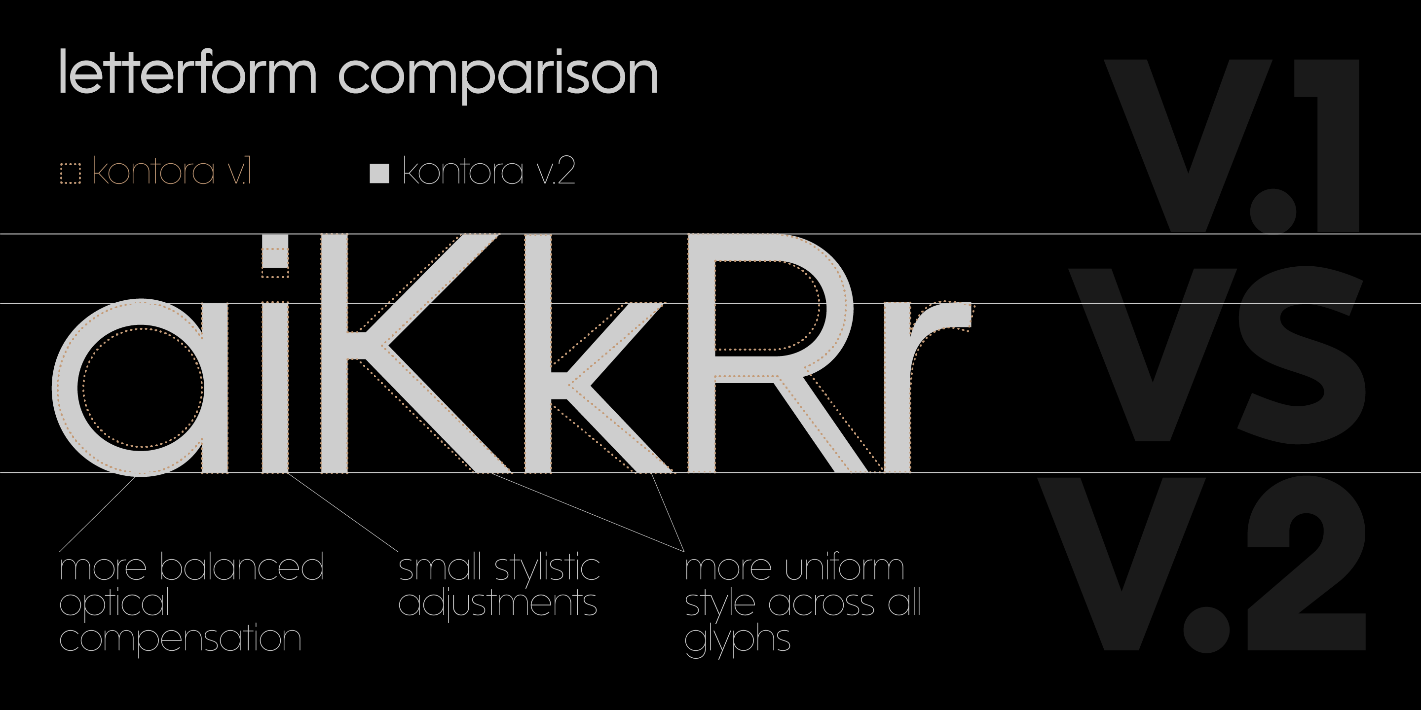
You can type something here!
You can type something here!
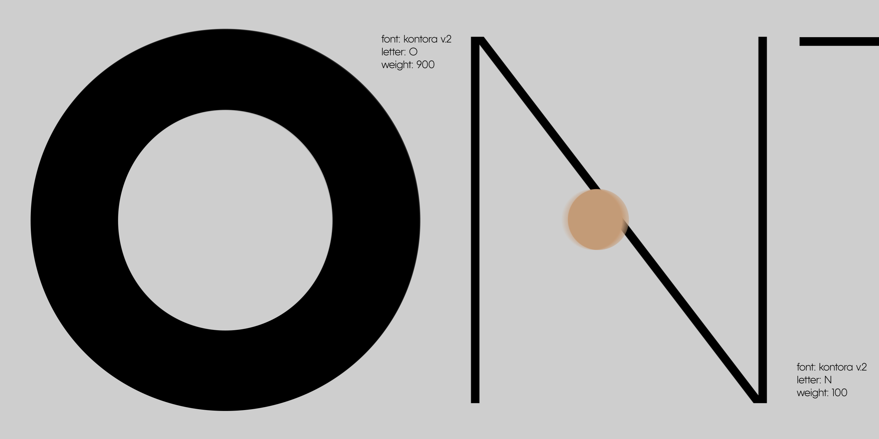
YOu cAn TyPe sOmeTHinG HEre!
You can type something here!